


Tiffany blue. Hermès orange. Cartier red.
Tiffany blue. Hermès orange. Cartier red.
The color of luxury

What does a color do? Make us feel? Last night, at dusk, the world went drippy, all of it (little bar, sidewalk, big tree) outlined by a yellow-gold August glow. Sigh, beauty, happy. I felt all of that. Wednesday night, I was walking with two of the most meaningful people in my life at dusk. Like with anything, the color felt brighter, and more important, because they were there.
At best, this is how luxury uses color. It’s a highlight, not always there, and it comes to us as a surprise and a symbol.
Just like the yellow-orange that accented the New York City street on that perfect late-august descent into evening; the best color ornaments, rather than consumes, the scene. It’s spare. Used in that right moment, then gone.
I am a strategist and writer, not a designer, so I reached out to my colleague and Massachusetts College of Art and Design grad Saleenah Saint Louis to tell me all about color in luxury:
“Color in brand is used in a lot of different ways. To relate to certain demographics, to evoke emotion, positive association, and trust. It’s one of the most important tools that is used to align a brand to a brand strategy. When it comes to luxury, though, the intent is more specific. In luxury design, owning a color isn’t so in your face. These brands use minimal color palettes: black, white, gray, maybe some gold. They use color to mark an occasion. It’s the Tiffany’s box, it’s the Hermes box + shopping bag. It’s an indication of a special shared moment. Your experience with the color then becomes memorable😊.“
She also added that a brand’s main color is its “primary color,” which I love. For some luxury brands, those primary colors have history.
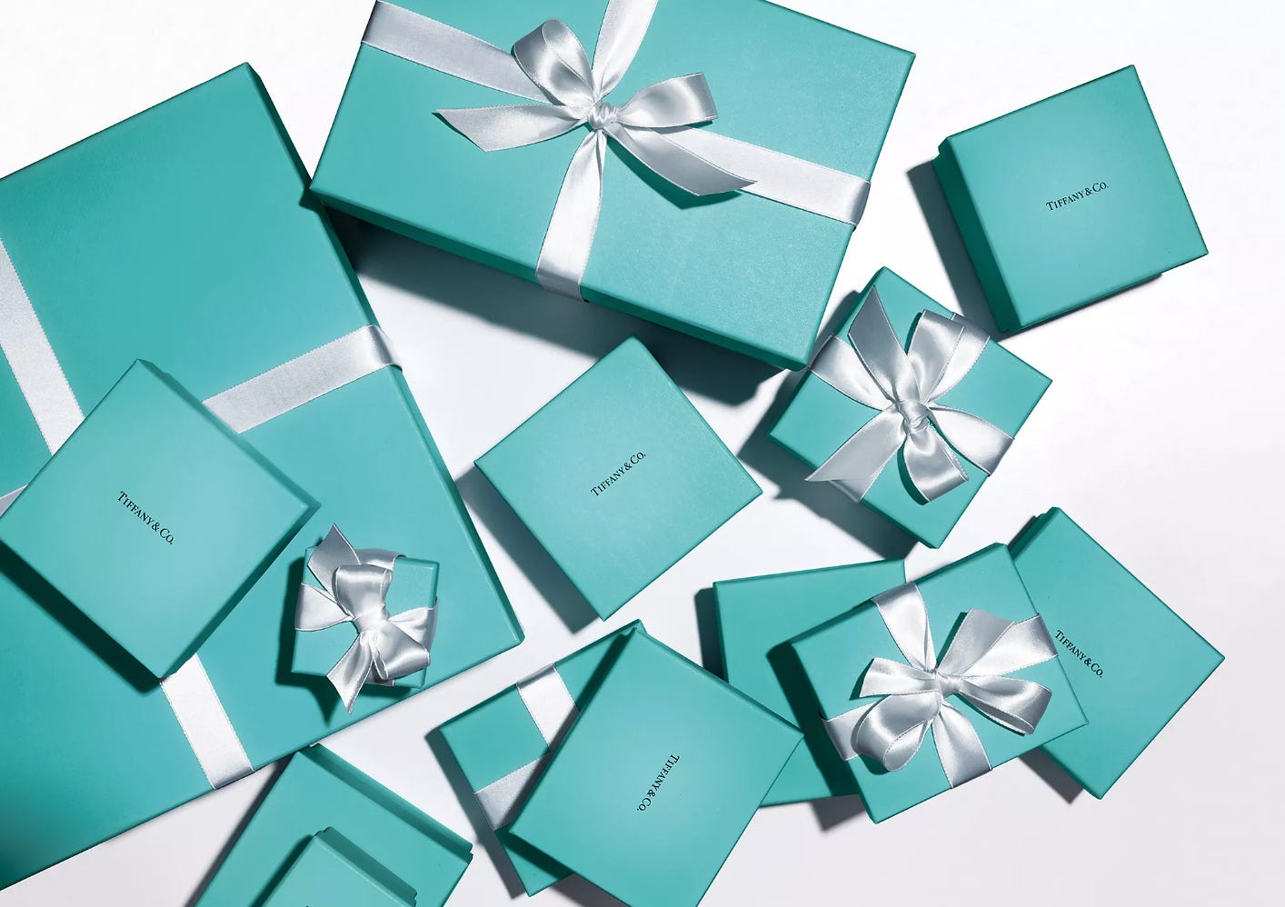
Tiffany Blue®, or Pantone 1837, is a global symbol of elegance. Its iconic robin’s egg hue, often presented in a white-ribboned box, has become synonymous with the brand. While centered around the concept of “love,” the blue packaging transcends the moment of purchase, focusing instead on the recipient of the gift. It's a perfect testament to Tiffany’s core brand position.
It works. My mom links the color to her dad, who gave her small Tiffany gifts as a child. “It’s nostalgic,” she said. “It’s the perfect blue. Not too light, not too turquoise, not too bright. Reminds me of him.”
The brand’s magic lies in its restrained use of the blue. Remember, the symbol is in the surprise. It signifies a special occasion, a fleeting moment captured in a box. It’s why I think the brand’s very blue new cafe in New York is a mistake. You overuse; you lose the magic.
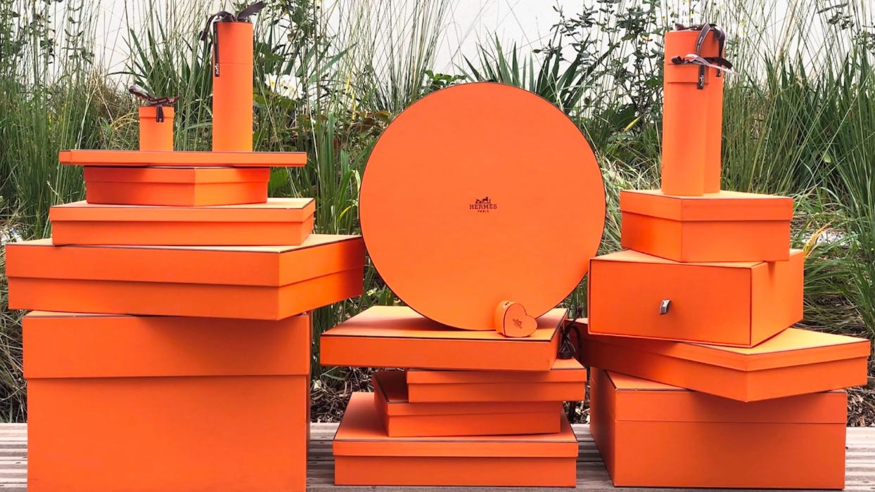
Less refined, perhaps, but no less iconic is Hermès’ orange. Born out of wartime necessity, this hue feels decidedly energized and optimistic.
Here’s a history behind the color, in the brand’s own words: “Its radiance is a general talking point. This warm citrus colour, which is not listed with Pantone, became symbolic of the house after the Second World War. Its appearance goes back to 1942, when there was a shortage of cream-coloured cardboard boxes. The supplier resorted to what he had left. It happened to be orange. Generations of boxes have followed on since then. A collector could tell them apart them by the depth of the shade, the grain, the logo, the band around the edges.”
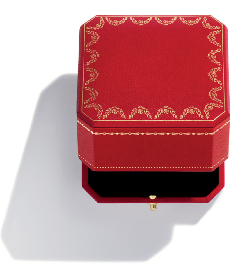
So, this coral-red-orange-salmon hue is still the primary color for Hermès. Of course, this brand is no less high-end than Tiffany’s but it is interesting (for me, maybe not for you) to think about how this color alters my perception. While the cool, measured blue of Tiffany’s makes me think of sophistication and almost restrained elegance, this orange feels confident and amusing, almost poking at me to play. Then, of course, there’s Cartier red. I wasn’t able to find a legitimate source unpacking the history of this color, so we’ll skip that. Let’s instead think about it in contrast to the Tiffany blue and the Hermès orange. It feels more glamorous, less restrained, maybe a bit lustful. To walk through a red-accented Cartier store, especially the location on 5th, makes you think of Old Hollywood. With this, the brand is less about intimate moments and meaningful bonds like Tiffany’s, or the joie de vivre of Hermès, but rather about pure and total indulgence. With Cartier, life becomes a red carpet.
Thinking about color and brand matters for every sector, of course. How does the yellow of Cava make you feel when contrasted with the green of Sweetgreen? How does the millennial pink of Glossier make you feel versus the beige of Rhode? Think about it, if you want. Or, don’t.
At the very least, enjoy an evening walk with your friends, and look at the light.